This morning I submitted a new version of Remote Control for XBMC for iOS 7. Finally. It’s completely redesigned from the ground up, which took me more than four months.
Why did it take that long? I wanted to bring consistency in the design of the app on iPhone and iPad and I tried to work out the best experience for iOS 7 on both devices. No pixel of the app has been left untouched by this update. It was a lot of work, but I am very happy with the result.
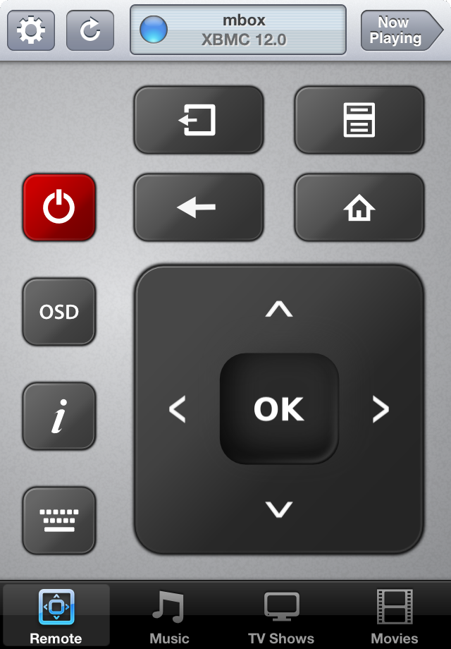
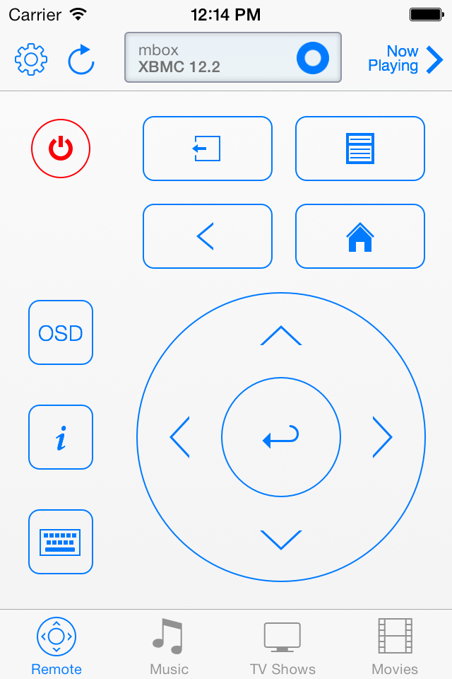
I started with the overall design and remote controls. I liked the connection panel I introduced for the iPhone version, so I decided to keep it in and bring it to iPad as well. The remote and library icons as well as the remote control buttons needed a more iOS 7 design aesthetic, so I redesigned these from scratch. Likewise, the player and volume controls buttons are also redesigned to fit the overall iOS 7 look. [1]
Launching the app into the remote controls view immediately shows the difference between the new design for iOS 7 and it’s original counterpart.
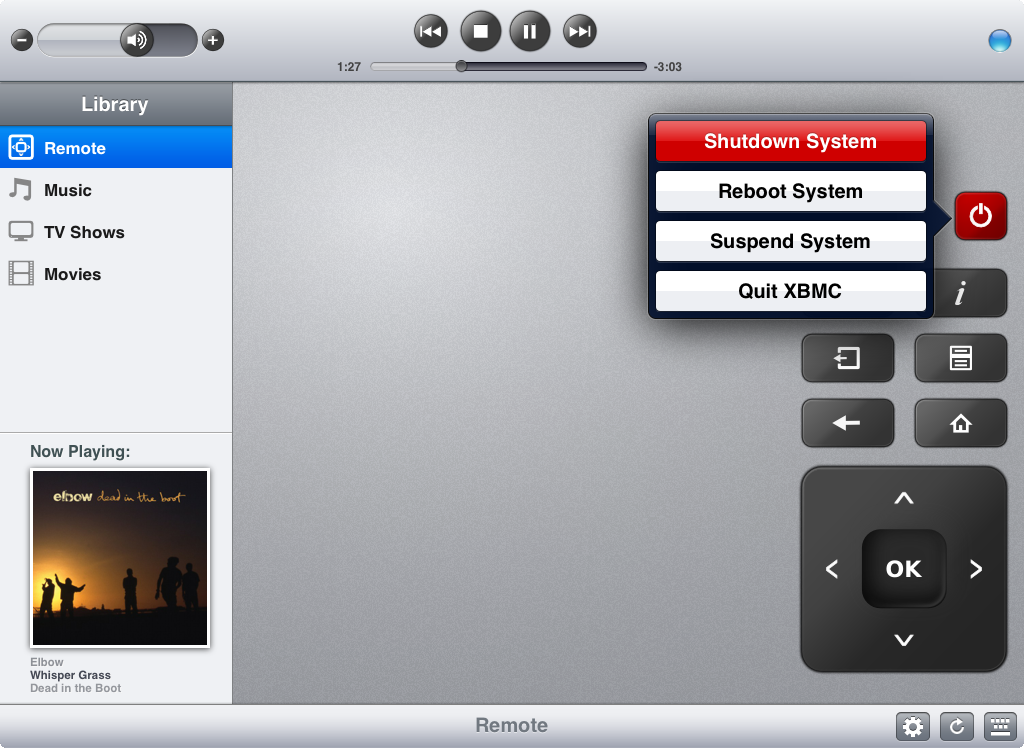
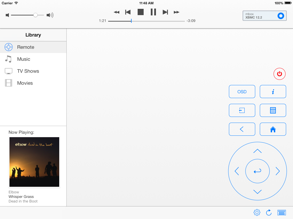
The player and volume controls are part of the root view on iPad, on iPhone they are on the now playing view, which got its own redesign. With iOS 7, there’s a nice depth-blur effect when the artwork slides in from the bottom of the screen. On iPad the artwork slides in underneath the toolbar and on iPhone it slides in underneath the player and volume controls.
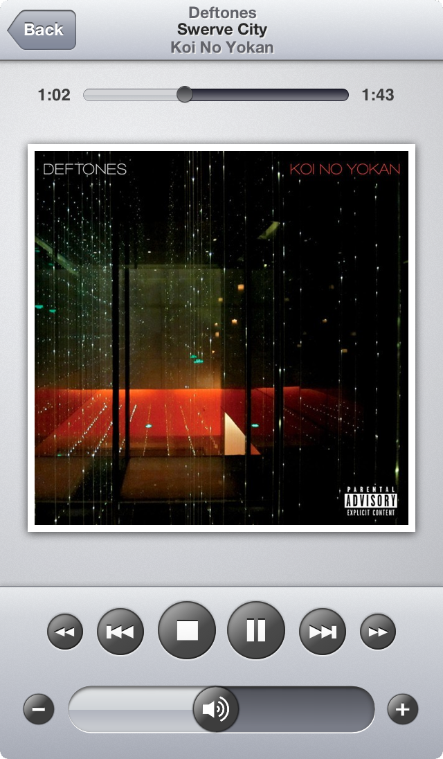
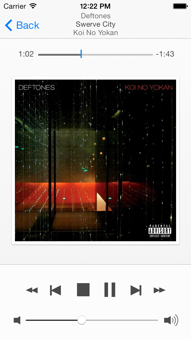
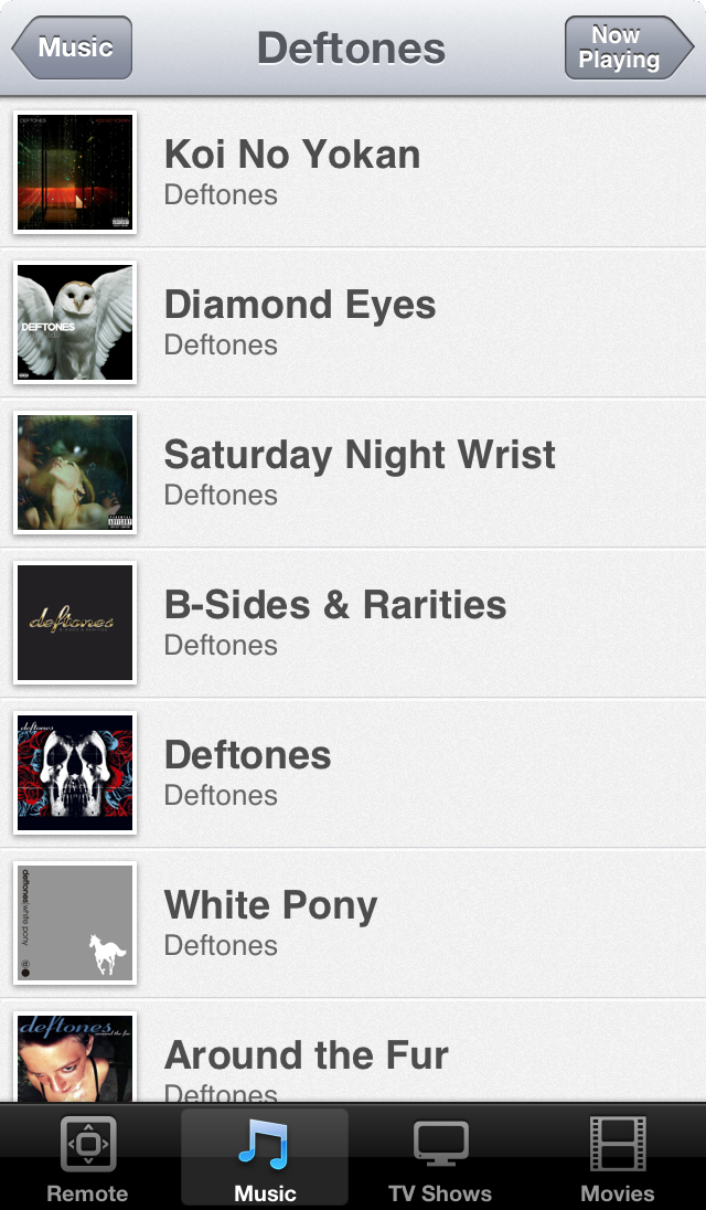
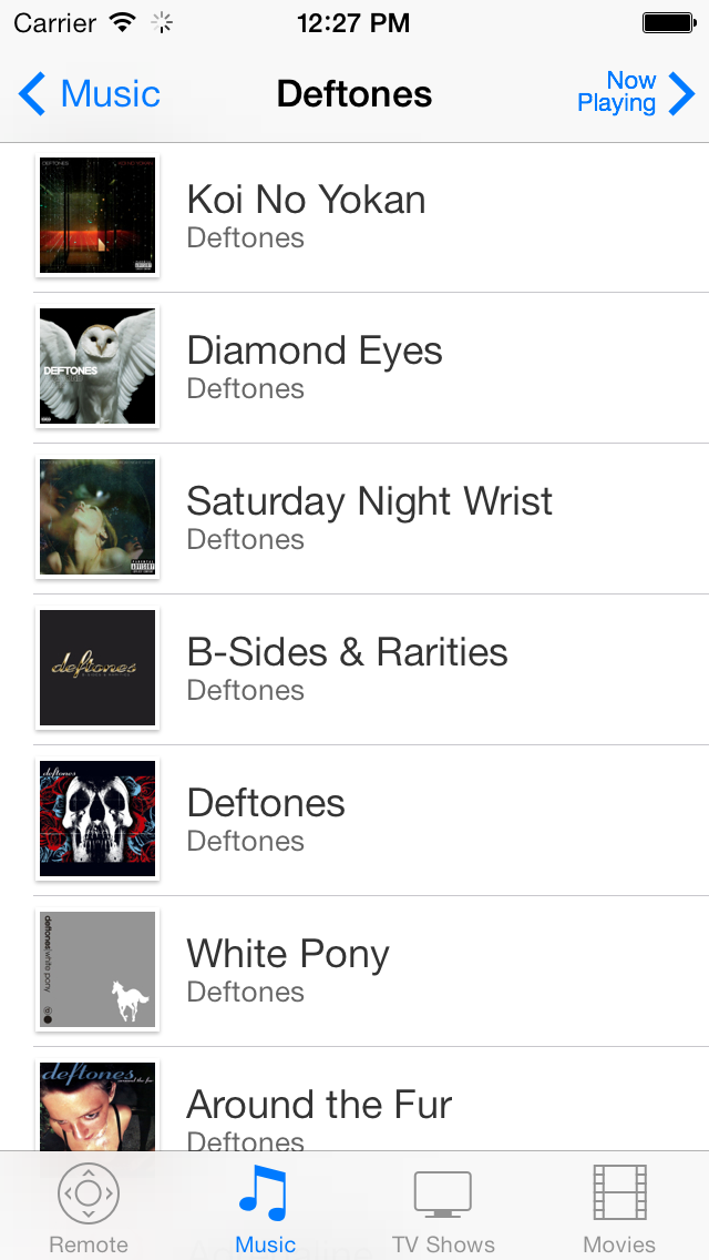
The original interface design for iPhone had a lot of custom designed interface chrome, but stock iOS 7 actually looks very good already. As a result I could remove a lot of images from the application bundle (shrinking from almost 15Mb down to only 2.9Mb). Also many custom UI tweaks could be removed from the source code. I loved that part. Nothing feels better than cleaning up and removing things while actually making the app better. Hopefully the iOS 7 stock UI elements look and feel don’t wear too quickly. The music library browsing views are pretty much the same with fresh coat of paint:
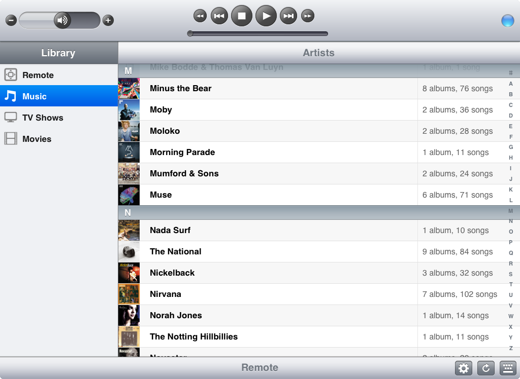
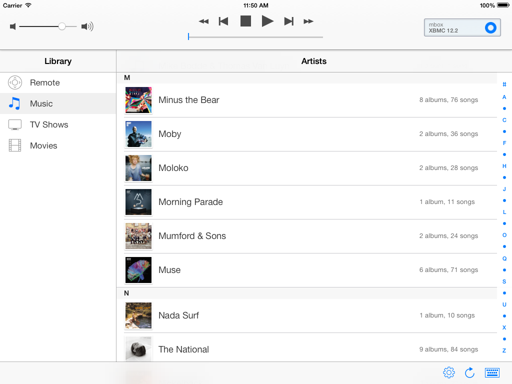
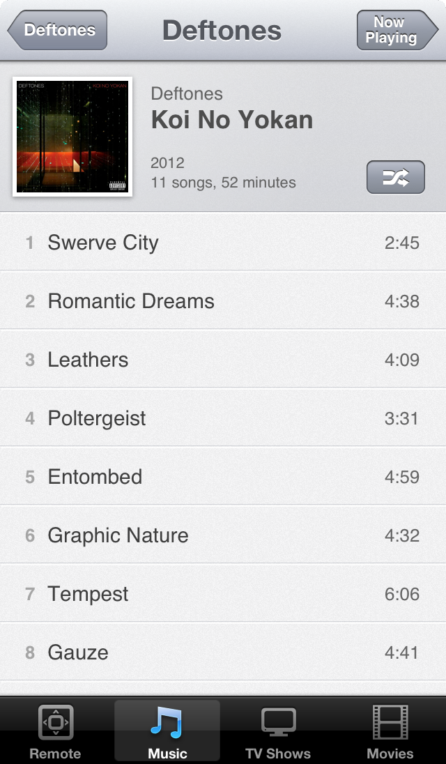
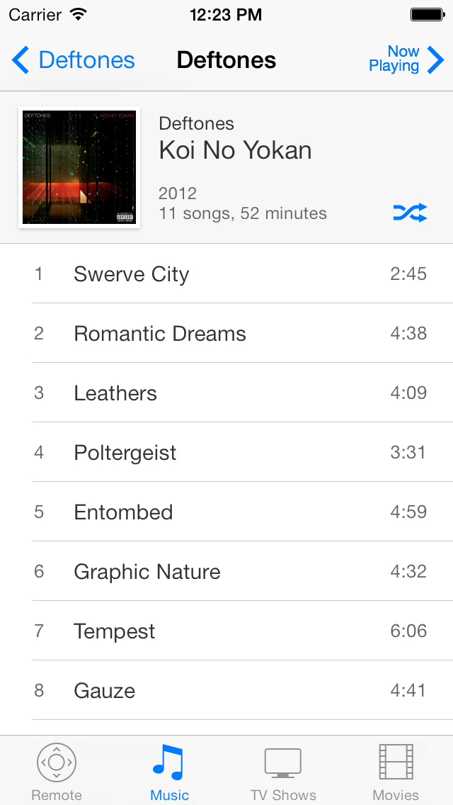
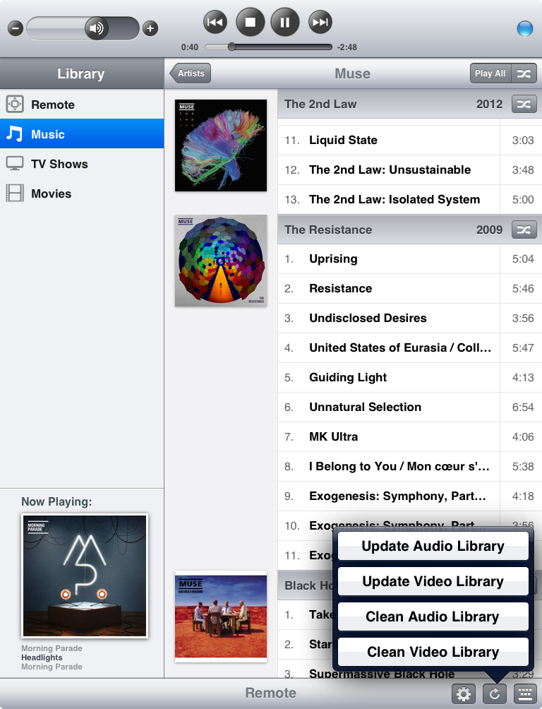
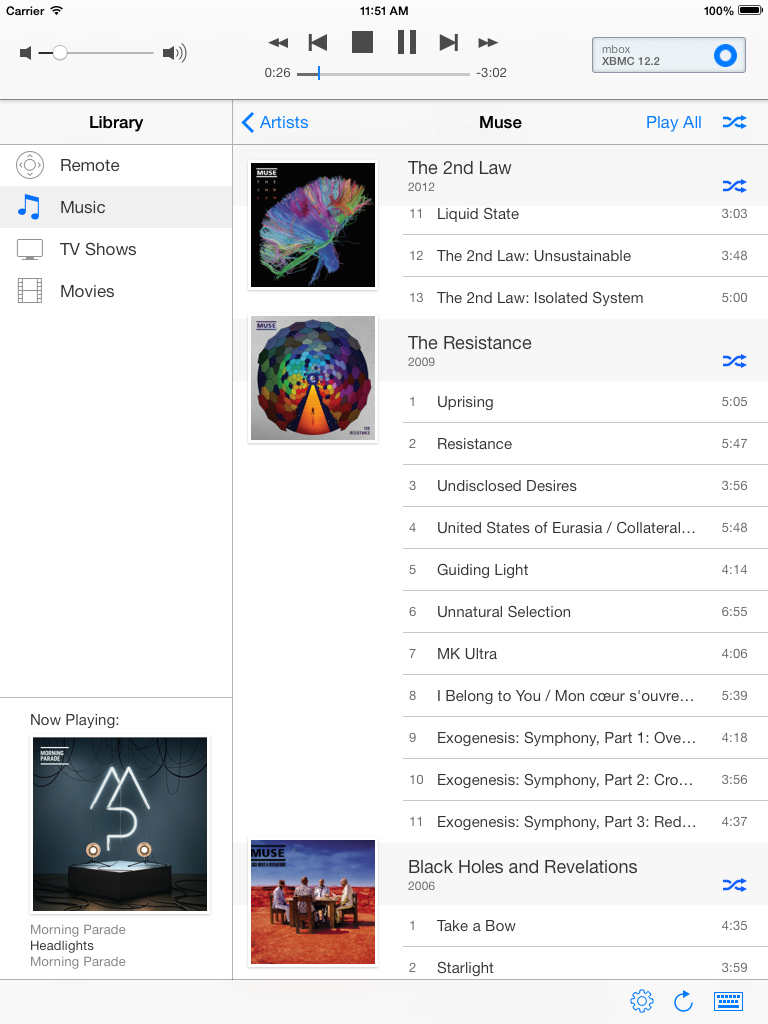
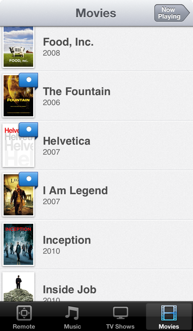
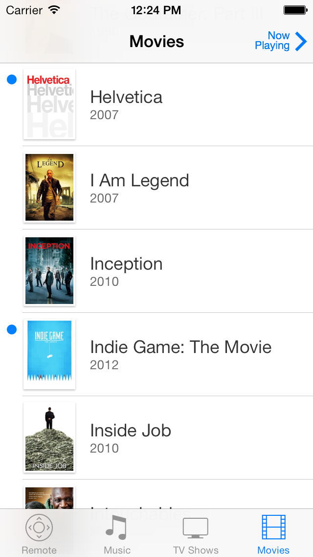
The TV shows section on iPad got a full make over, to make it more consistent with it’s iPhone counterpart. On iPhone, the TV shows view only got a cleaner look, except for the number of unwatched episodes badges. I have tried to make these more consistent with the way Apple’s iOS apps shows unread, unwatched and unlistened items. The screenshots show the banner style lists (which I personally like more), however TV show posters are still supported as well.
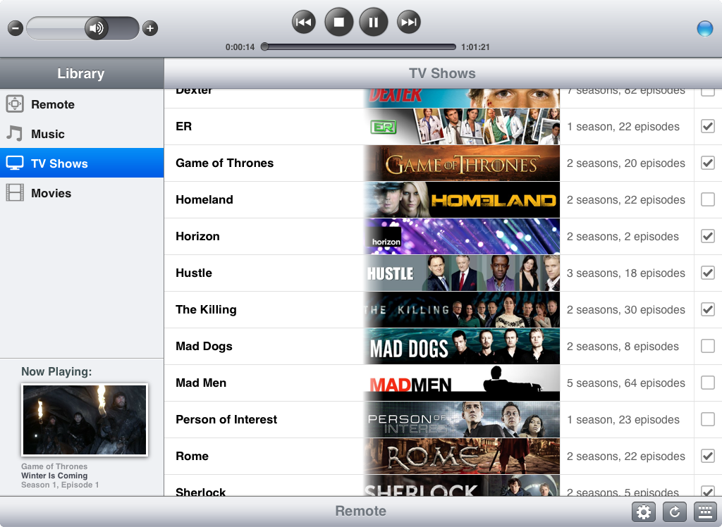
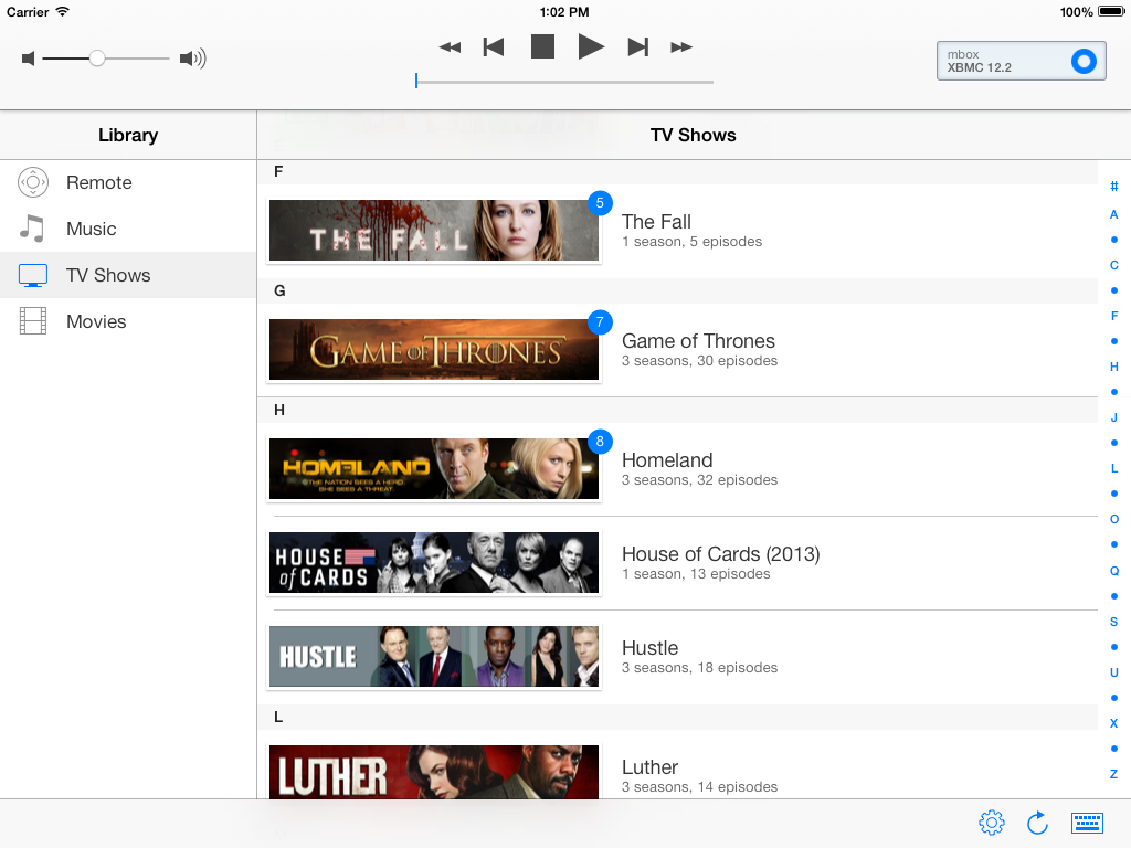
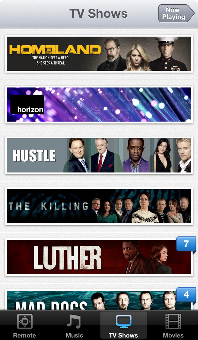
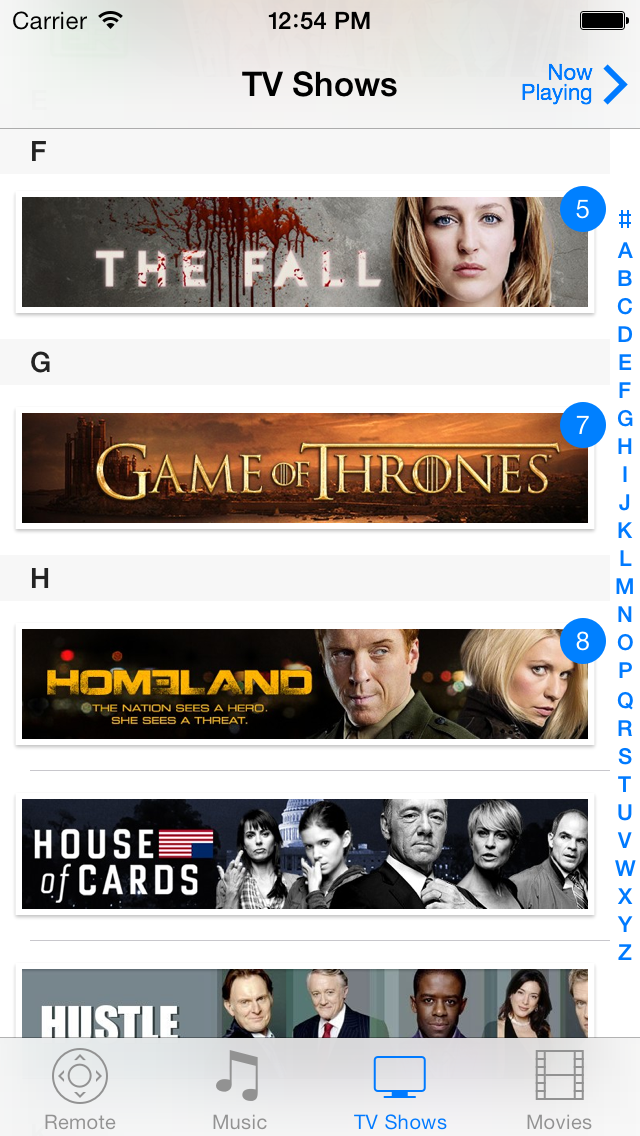
The detailed TV show view is mostly a design make-over on both iPhone and iPad, again except for the unwatched episode indicator.
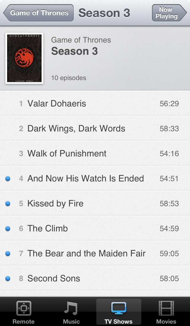
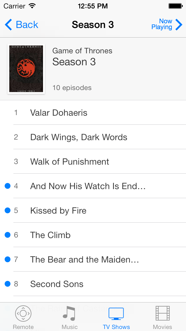
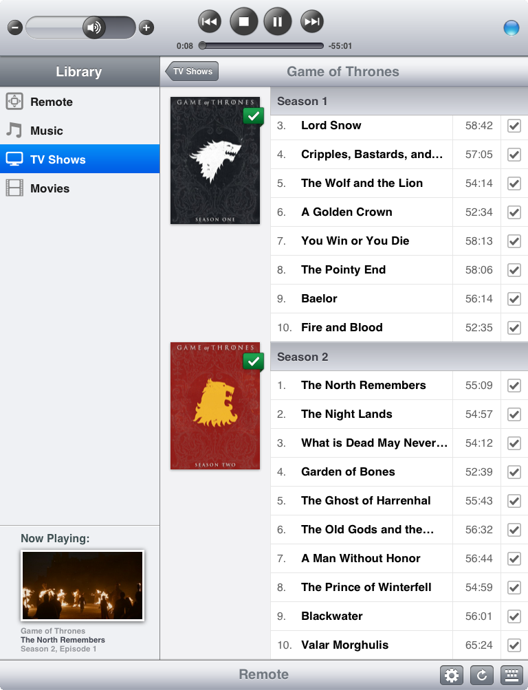
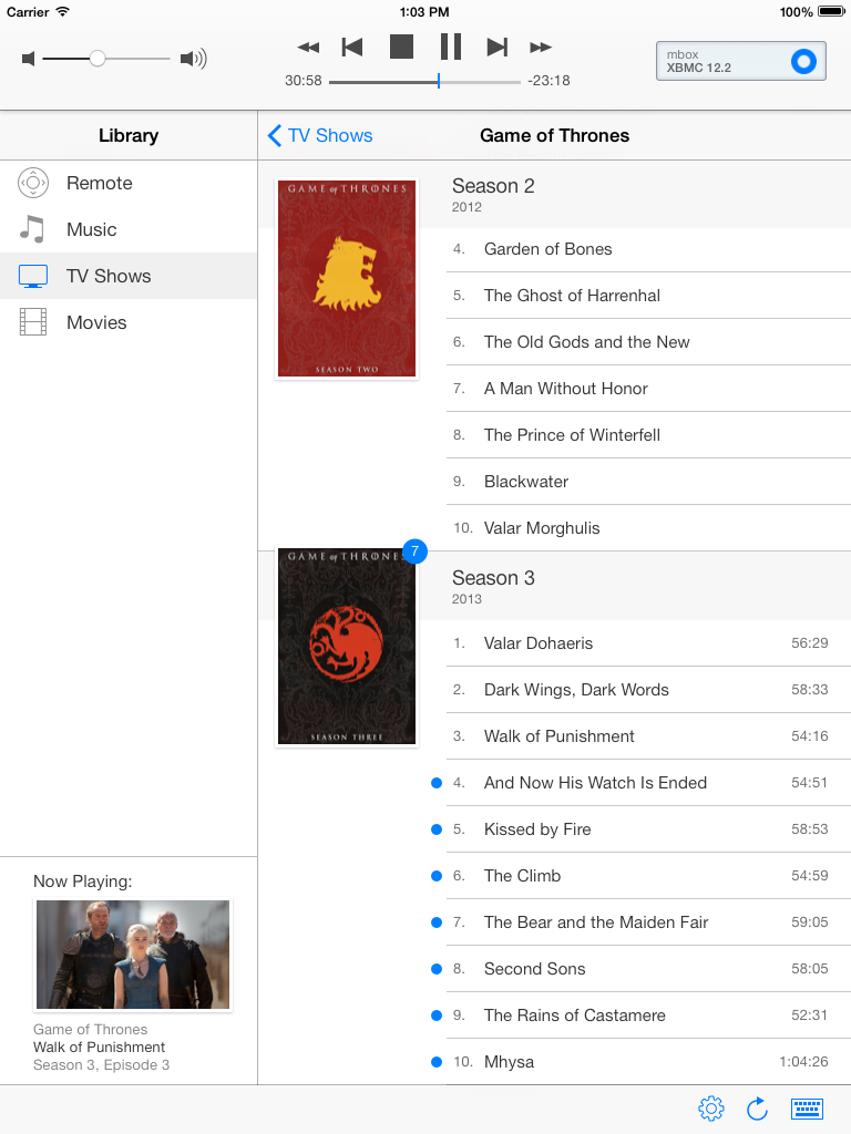
Finally the movies view also got the new style of flagging unwatched ones. On iPad the movies browser got a more significant redesign to make it more consistent with iPhone, similar to the TV shows redesign:
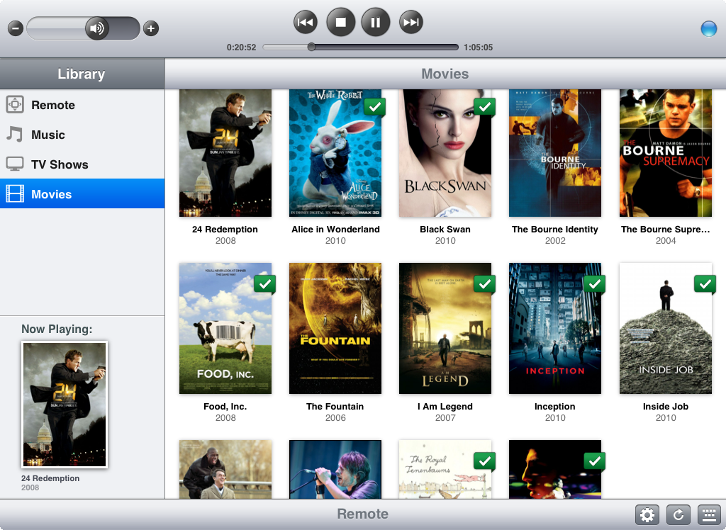
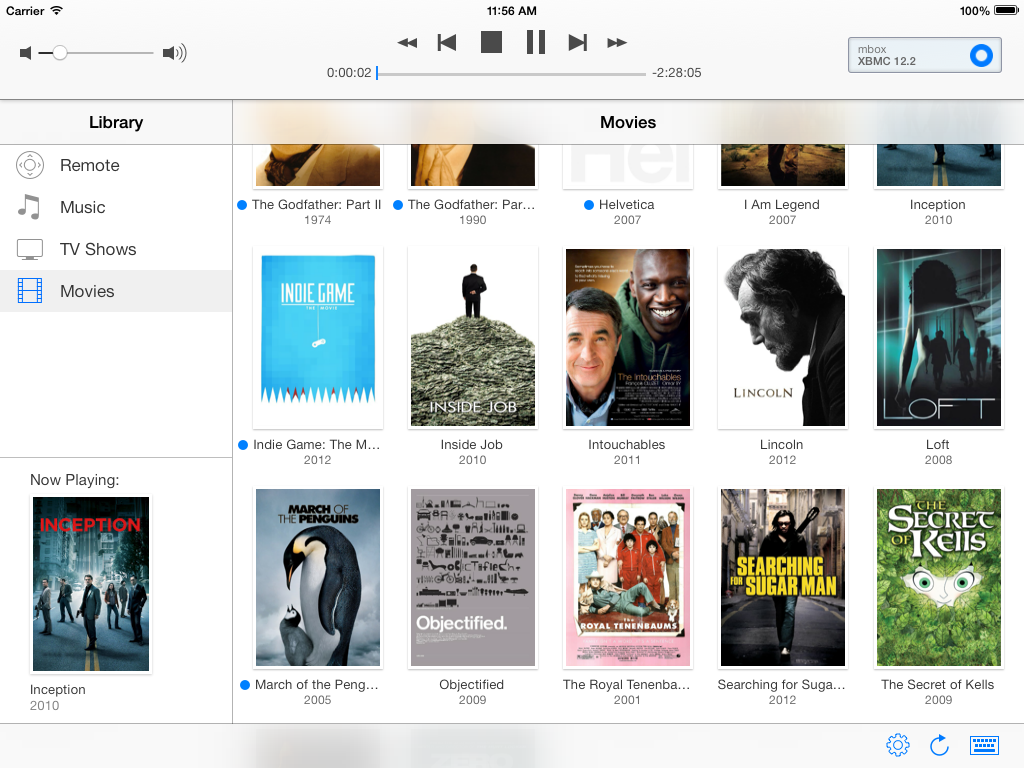
The new version will be a free update, available on all devices that support iOS 7. As I mentioned before, I’m very content with the new looks and I enjoy using my own app almost daily. I hope everyone out there who is using or who will be using Remote Control for XBMC will enjoy it as much as I do.
| [1] | I originally did my design work in Inkscape, but since I’ve bought Sketch, I’ve recently done all design work with it. It’s really the best UI design tool I know and well worth the purchase. With this full app redesign I’ve moved over all pixel based UI design work for Remote Control for XBMC to Sketch. |